Slack was built as a communication tool to collaborate effectively with teammates under little friction. Over the last few years, Slack has matured from a simple chat platform into an application platform that can deliver beautiful user experiences.
As the number of Slack integrations and bots continues to rise, best practices have emerged to ensure that Slack interfaces are intuitive, effective, and able to retain users for months to come. In this article, you’ll find five simple hacks that allow you to enhance your bot’s UI in Slack. We break down both the motivation that led us to these Slack UI hacks and the specifics of how we implemented them. None of these tweaks require more than a few lines of code and all bring simplicity and clarity to your user experience.
Feel free to use these hacks in your own Slackbot UI and give your users a more intuitive and pleasant experience. Check them out:
1. Create Collapsible Menus
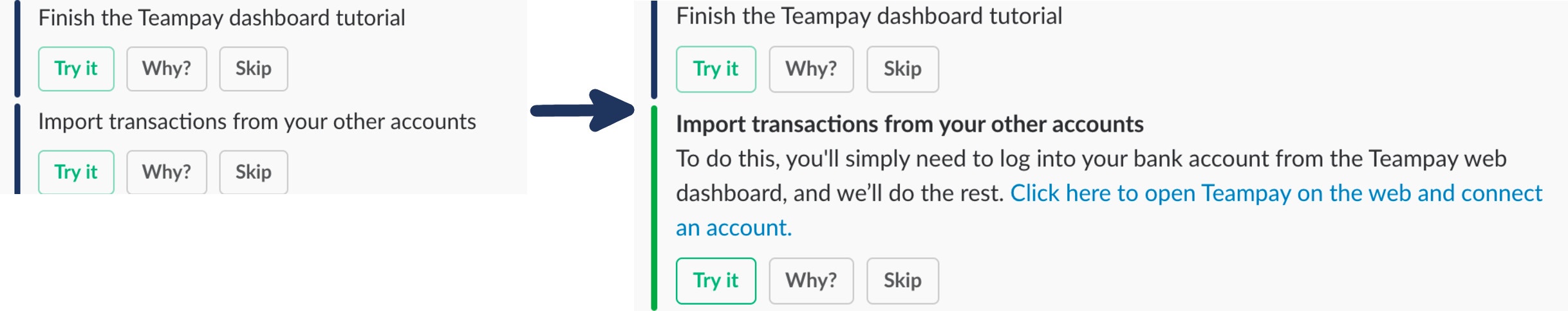
Our motivation for this UI hack:
We often want to provide users with a large amount of information all at once. In this example, we’re detailing a few actions you can take to improve your account completion. When we initially dumped the information onto the screen in full it was an overwhelming wall of text.
What we did:
The trick is using the UI principle of “progressive disclosure”. No user needs to see all the available information at once. They’ll want to request specific info on a topic that interests them.We provided separate attachments for each topic and allow users to select the topic they’d like to view using buttons. When the user clicks “Try It” or “Why?” the attachments expand to include a text section with a detailed explanation.
Finally, clicking the “Try It” or “Why?” buttons a second time contracts the message. This has two benefits. First, the attachments feel more like a classic accordion widget. Second, we ensure that clicking a button always results in a visual action taking place, making the UI feel more responsive.
2. Format Attachments using Placeholder Images
Our Motivation for this UI hack:
Slack’s attachment formatting can be a bit temperamental when attaching images. Specifically, when using the image_url attribute, attachments that are supplied a blank or invalid url act as though they weren’t given an image at all. This creates a different formatting style in each of the attachments, as you can see the above-left image.
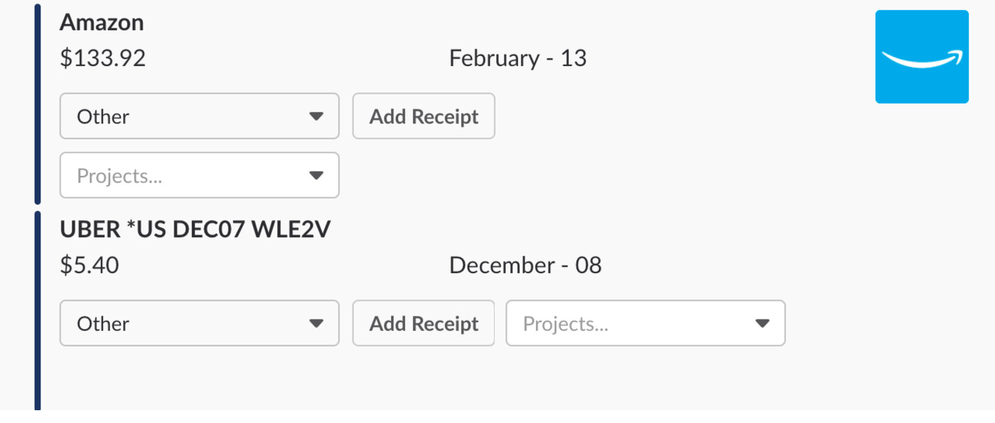
What we did:
We serve a tiny 1x1 pixel transparent image any time that image_url would be unfilled. While the tiny transparent image isn’t visible, Slack’s formatting is still convinced that there’s an image attached. As in the second image, everything lines up properly.

3. Create Pretty Pagination
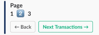
Our Motivation for this UI hack:
The UI elements that Slack provides aren’t well-suited for displaying large data sets to the user. While we’d never recommend dumping hundreds of rows of data into a Slack channel, there are some things you can do to make the display of a simple data set more painless.
What we did:
One of the easiest ways to improve readability is pagination. A user should never get lost in a data set and the ability to navigate forward and backwards are essential.Since Slack doesn’t provide any UI options for pagination we created our own. We create a single attachment below the displayed data and use the usual bold unicode numerals to display unselected pages. The selected page uses the emoji for that number (e.g “:one:”, “:two:”, etc. in Slack’s shortcode) to draw visual interest.
4. Use Images to Make Tables
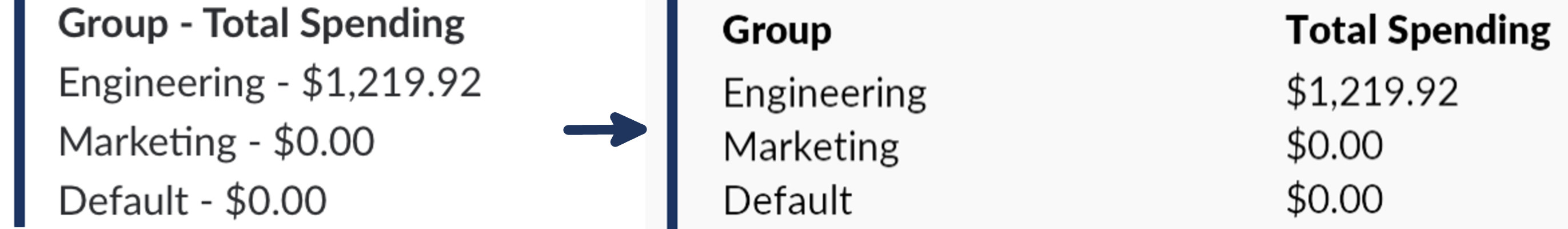
Our Motivation for this UI hack:
Another frequently used but not yet Slack supported display is the simple table. We wanted to display group spending data to users in a slack attachment but found that without official table support we were limited to ugly text rows or attempting to squeeze everything into the Slack attachment’s “fields” option, which quickly became a formatting nightmare.
What we did:
We generate static images from the table data and attach them to a Slack attachment. Specifically, since we’re using a Python/Django backend we used PIL (the Python Imaging Library) but every language should have an easy to locate, text-to-image solution.
For extra polish points, Slack’s font, Lato, is freely available and makes your image look seamless with the rest of the attachment.
5. Include Confirmation Buttons With Drop-down Menus
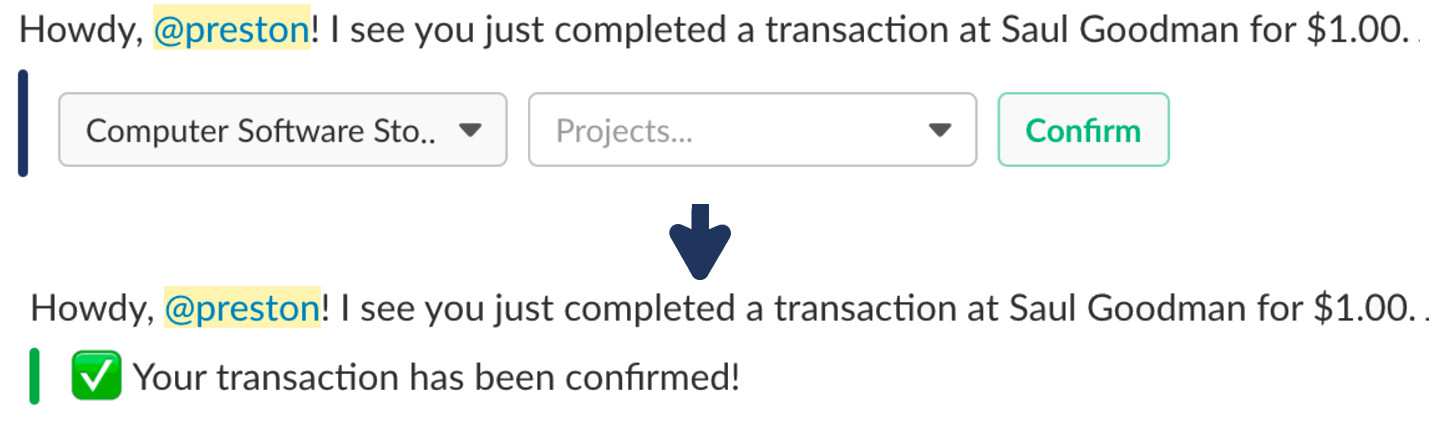
Our Motivation for this UI hack:
Drop-down select menus are a relatively new Slack feature and they allow for a lot more flexibility in your UI. However, some users find it strange that there’s no need to confirm their selection after its made. The data packet is sent (and thus the menu is “confirmed”) as soon as an item is selected. Without strong visual feedback, there can be uncertainty as to whether their selection was actually saved. This becomes even more confusing when there are two menus present as above.
What we did:
We added a regular Slack button to the attachment that allows the user to “Confirm.” The button doesn’t actually do anything other than visually change the Slack attachment to display the confirmation message. It doesn’t manipulate any data (we already updated the user’s choice when they made a selection in the drop-down menu). The confirm button and subsequent attachment update serve solely as visual feedback to the user and provide them with absolute certainty that we received their request.
Three Slack UI Lessons Learned
There’s a surprising amount that can be accomplished inside the confines of a Slack app. We learned a few key lessons while designing Teampay’s Slack UI, such as:
- No amount of visual feedback is too much. Every button, menu, and interaction should have some effect on the attachment it’s part of.
- Where Slack doesn’t provide a UI element (tables, pagination, collapsible menus) it’s possible to create an approximation.
- Don’t be afraid to get creative, there’s a lot of flexibility in Slack’s attachment API and the supported configurations. Stretch it to your advantage.
Slack makes for a comfortable and, with a little effort, beautiful place to make your app an easily accessible, and prominent part of your user’s daily workflow. We believe, if you take the time to creatively think through your design decisions, you’ll find it worthwhile.